App Design: Crisis Cleanup
This project is a re-design of Crisis Cleanup, a web application in dire need of a reincarnation as a mobile app.
01
02
03
04
05
06
07
08
09
10
Hurricane Harvey
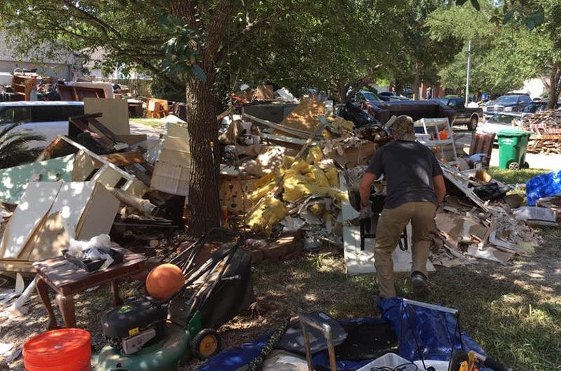
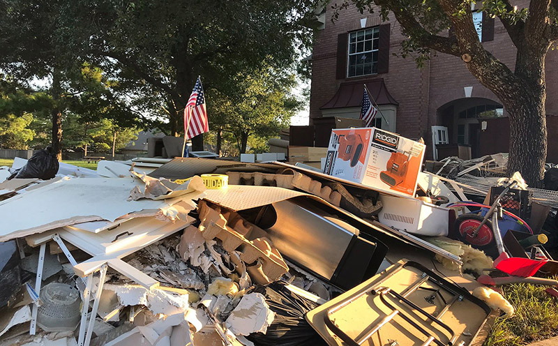
When hurricane Harvey hit the southeast coast of Texas, most expected the storm to hit hard and move through the area in a day or so, like most hurricanes do. Harvey had other plans and hung around and dropped well over 50 inches of rain in four days.
The need for rescue and cleanup personnel was astronomic. Hundreds of thousands of families, most without flood insurance, risked losing their homes. The logistical challenges of coordinating thousands of crews of inexperienced volunteers require very good tools—those with the usability to create the highest time saving efficiency possible.
A Case Study
As a volunteer I was assigned to be a Crew Chief, which meant that I was asked to lead a crew, watch over their safety, and add new homeowners to the jobs assignment system using an internet application on my smartphone.
Because crew chiefs are at ground zero of the cleanup effort, they find the jobsites and enter the information into the system. There was only one problem: The software, Crisis Cleanup was not designed for use on a smartphone. This introduced massive usability inefficiencies in the cleanup work. The goal of the redesign was to fix this problem.
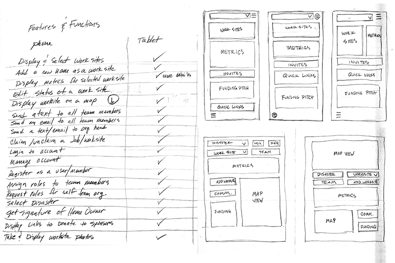
Planning & Sketching
These images contain an initial list of features and how they map to the smartphone and tablet platform as well as the desktop application. The feature list then gets translated into screen sketches that start to layout the real estate of the various functions in grouped screens with priority given to the variables of usability.
Not shown is the work I did to create a Persona and Scenarios to assist in testing the prototypes. These aid in creating a heuristic analysis in the testing phases to bring the needed issues to the forefront for iterating the design until design goals are met. The Persona represents the target user base. The scenarios help create a testing script and focus on the key tasks the user must perform to accomplish their goals.
Wireframes & Mockups
These are a few of the 60 or so sketches that show the layouts of the various smartphone and tablet screens. These sketches were used in the first paper prototypes I created for testing. In this early wireframe form I was able to see if every major feature and function had appropriate grouping and visibility that was easily located.
The mockups were created after the first round of testing and then were tested again before creating the first digital mockups.
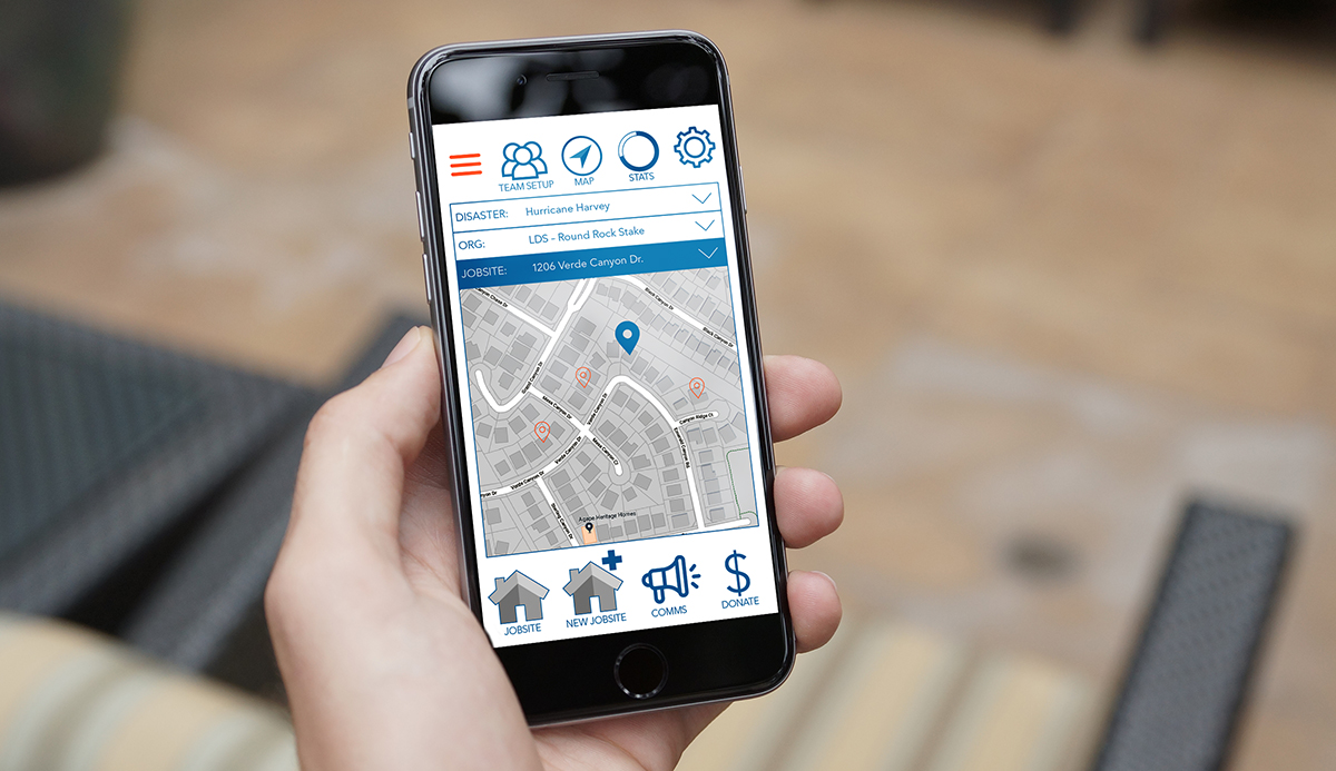
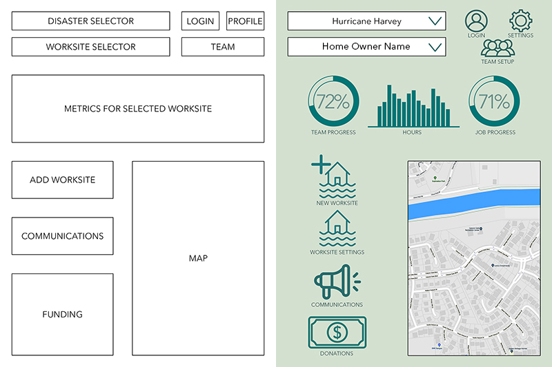
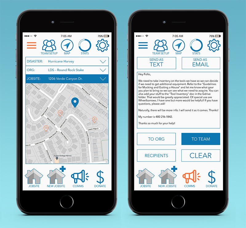
Setup & Comms
These layouts show the final screens for the disaster, organization, and job selector over the jobsite map. Also included is the communications screen layout. This layout has dual functionality to send emails and texts from the same console and is controlled with a toggle for selecting either email or text output.
There were three target platforms, smartphone, tablet, and desktop. Because the problems with the original design were smartphone usability, my main focus was with smartphone usability. Even though the tablet is also mobile, tablets are less likely to always be with the crew chief and they can keep their phone in their pocket whereas tablets are a bit large for this kind of availability.
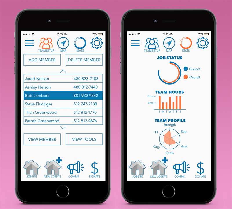
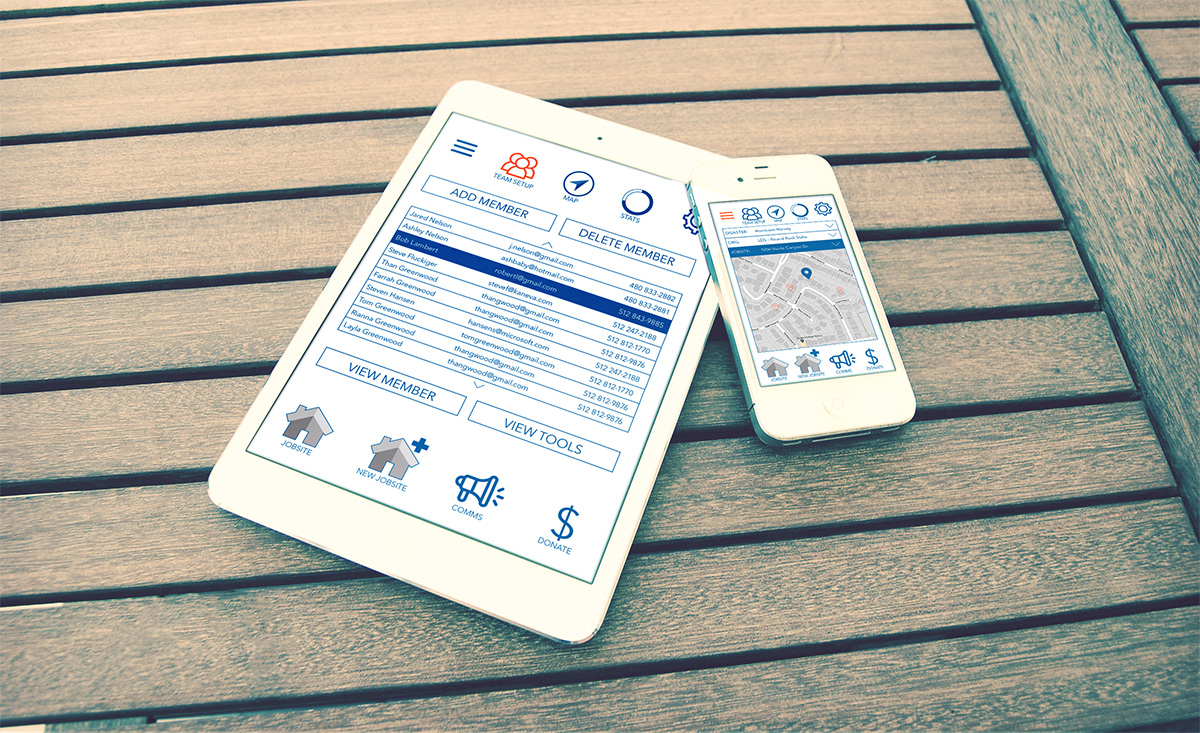
Team & Stats
These layouts show the final screens for the team management screen, and the Statistics screen. The team management screen is where team members are added, deleted and managed. From this data, a team profile is created to allow for the crew chief to evaluate and make plans for adding resources and selecting jobs the team can handle. The statistics screen helps track team work hours, makeup and abilities and job status.
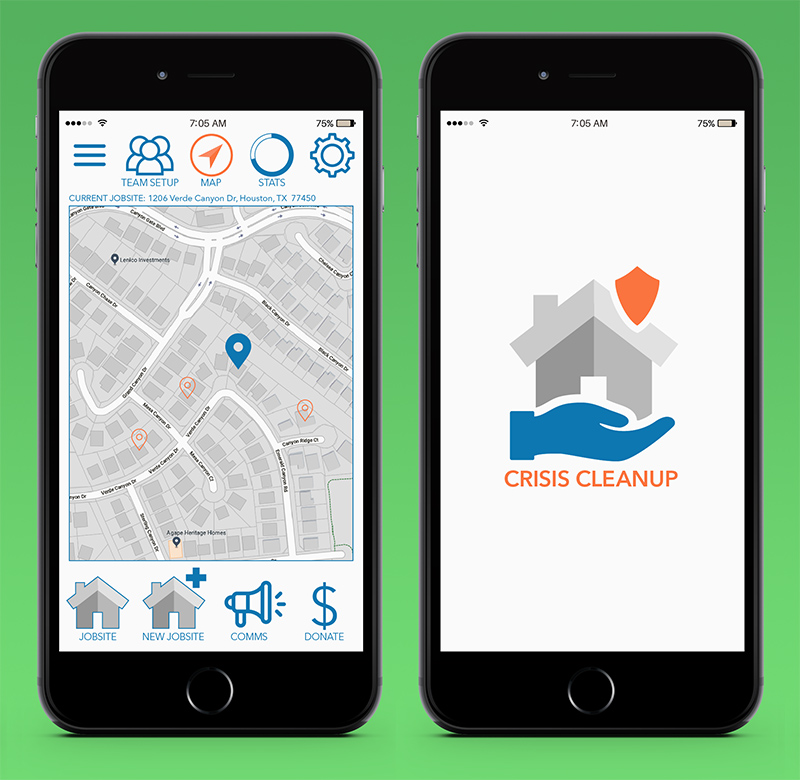
Map & Branding
These layouts show the final screens for the branding screen and the map view. Functionality for the map view is intended to mirror conventional swipe for pan, pinch and spread for zoom-in and zoom-out. The branding screen functions as a splash screen for login and loading.